Wednesday 28 May 2008

Sharp: Nigel Parry


While out on one of my lunchtime walks, I got myself down to Waterloo and had a wander round the streets. I found a discount bookstore and had a look around to see if they had anything decent on sale. I was in luck, they had a few copies of Sharp by Nigel Parry going for £9.99. This is a weighty tome, one square foot of hardbound, gorgeous black and white photos of celebrities. The majority of the photos are printed edge to edge on the square pages with excellent print quality. Its very light on words, none of the images have captions and each section of the book starts with a short sentence or even a single word, but there is a very helpful directory at the back if like me, you aren't great at remembering names of celebrities.

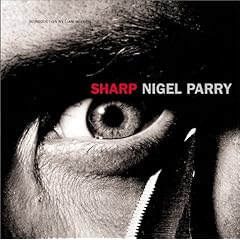
Many of the images are reminiscent of Trevor Leighton's Jokers, dark contrasty black and white prints, very direct and intense, frequently closely cropped. Hands feature quite prominently in many of the photos becoming key elements of the composition much like Jane Bown's portraits. Nigel Parry's lighting is more sophisticated than either Leighton or Bown's. Looking into his subject's eyes is quite revealing, you'll get an idea of how he is lighting them from the softboxes relflected in them and sometimes you'll get a portrait of the photographer himself in silhoette.

There are some great examples of portraits using restricted light, the portrait Robert Vaughn and David McCullum as the men from uncle, has them shot almost in Silhoette against a pure white background, with just their faces picked out with snoot. Of course there is a twist, they are shot through glass with a bullet hole placed over one eye of each of the actors.

I love the way Nigel Parry has used the edges of the frame, his portrait of the cast of The Ice Storm, cramming all the heads right into the top of the frame, cutting off the tops of their heads, leaving a large expanse of black down to the bottom of the image. The composition looking like some kind of portcullis. His portrait of Senator John McCain is another great example, his head down in the bottom two thirds of the frame his mouth covered with his fingers, it really is quite striking.

This is definately a book to look to for inspiration and will be a treasured addition to my bookshelf. You can find some of the images from Sharp here and more from http://www.nigelparryphoto.com

Tuesday 27 May 2008

Learn to light with the strobist DVD


The long awaited day has arrived, David Hobby has unleashed his strobist DVD on the world.

I've been nagging many of my friends to read strobist.com, but the simple fact of the matter is that there is a hell of a lot of material to get through and because it's a blog it's not always structured in the most accessible way for learning. I sometimes have trouble navigating to articles that I want to re-read and I've been reading it from quite early on.

I think many people don't read the site from end to end, as evidenced by the number of questions in the flickr group, that already have detailed answers in the blog.

Up until now, the best way to get up to speed was to go on one of the strobist seminars that have taken place all over the globe, but they are few and far between. Having been on the London seminar, I can tell you that it is worth every penny and true to his philosophy David's seminars are excellent value for money.

But now for less than the price of a seminar, you can watch David in action on 8 DVDs over ten hours. So if you were thinking of getting into strobism but haven't read the whole blog, this looks like it might be the best way to do it.

For the soft sell, hop along to Strobist.com and read what David has to say about it. He has an excerpt on youtube so you can see the sort of thing you will be getting. Oh and hurry up, there's only 1000 and they are selling like hotcakes.

Friday 23 May 2008

Fantastic Voyage: The Photographs of Arthur Tress


My mother tends to have a look around posh charity charity shops and every now and then she finds something interesting. The other day she gave me a book by Arthur Tress that she had picked up.

I'd never heard of Arthur Tress before, but his photographic projects are works of pure genius. The book had one of those lengthy florid introductions that... well lets just say it could have given psueds corner in the Private Eye about a year's worth of material. But the photographs were brilliant and imaginative.

The thing I loved most was the way that he would pick a theme and produce a full coherent set of work from it. The dreams of children, the dreams of adults and Shadow. Shadow in particular impressed me. It was a large collection of black and white photographs representing a mystical quest for enlightenment, that reminded me a great deal of Paulo Coelho's novel the Alchemist. In each photograph Arthur has encorporated his own shadow into the picture to tell the story.

Now if you have managed to get hold of this book I must warn you to be careful if you are reading it on the bus. I turned the page to be confronted by a decrepid manequin felating a young man. Tress' male nudes are rather interesting, but you don't really want the person sitting next to you on the 168 getting an eyefull. Or maybe you do...

Friday 16 May 2008

Don't forget the competition


Don't forget to enter my competition to win a copy of Creative Lighting Techniques for Studio Photographers. Just follow the links to find out how

Tuesday 13 May 2008

Shared Boundaries


Shared Boundaries

OK, so this photo isn't going to win any awards, but I have posted it here because it illustrates an interesting compositional technique. If you haven't worked it out already, its a set of railings and the shadows cast by them. When framing this composition I deliberately made the shadow and the bottom of the railing share the same boundary. When you look at that central line, the perspective has collapsed and the image seems to flip-flop between having the base of the railing above the shadow to having it below.

Contributing to this illusion is the way in which you interpret a scene. Pyschologists have concepts of leveling and sharpening. If you are a leveller, you tend to simplify your experiences, you tend not to notice differences. If you are a sharpener you are a little more analytical, you will notice things that are out of place. In relation to this image, if you are a leveller, you will tend to treat the shadows on the base of the railing as a continuation of the shadow on the ground. enhancing the collapse of perspective.

Another thing that lends itself make a little confusion is that there is a figure ground relationship between the shadow and the ground. Because the lit areas have a clear boundary, they tend to be seen as a figure making them pop-up just a little.

Even though I know exactly what I'm looking at, I still experience some visual confusion. I'll be looking for more opportunities to use shared boundaries for abstracts in the future but hopefully prettier ones than this.

Monday 12 May 2008

Win a photography book


A christmas wishlist mix-up meant that I got two copies of Creative Lighting Techniques for Studio Photographers by Dave Montizamber. I was considering selling it on ebay but I thought I would use it as a prize in a competition.

So how do you win this prize? Its simple, I want to know a little about what sort of people are reading the blog. So I'd like you to email me a little bit about yourself, and I will pick a winner and post them my extra copy of the book anywhere in the world.

Here's what I want to know:

  • Your name
  • Where do you come from
  • Your website/flickr/pbase/blogger address
  • A link to the photo you are most proud of taking
  • What sort of photographs do you like taking
  • Who is your favourite photographer
  • Give me a short biography of yourself and your photographic history
  • What brought you to my blog


I don't know how I'm going to choose a winner, so amuse me or impress me. Send me your answers to paulo.rodrigues@blueyonder.co.uk and in a month's time I'll post the details of the winner. BTW there is no need to give me your postal address unless you are supremely confident of winning. I'll contact the winner to get their postal address.

Terms and conditions: You cannot enter if you are my mum. I already have this book and don't want it for my birthday. Your email address will not be used for any purpose other than to contact you to tell you you're the winner, or to tell you how much I appreciated your email. Your email address won't be resold, or used to sell you products or services. I most definately will not be passing your details to the FBI, the CIA, the FSB or MI5, unless you specifically request it. Er... thats it.

Sunday 11 May 2008

Want to see more of me?


No I don't mean me. I'm talking about the exhibition of that name by Donald MacLellan thats currently showing at the national portrait gallery. I was down there one lunchtime, to see the Vanity Fair Portraits and on the way out I popped into a side room and saw Donald's wonderful portraits of black actors.

Don't take this the wrong way, but I love black skin. I love its richness and sheen and the way it picks up highlights, it just looks great in print. Donald MacLellan's portraits have backgrounds that complement that richness, sometimes in surprising ways. His image of Shaun Parkes was instantly striking with a brown background and brown leather jacket, making Shaun's eyes the very first thing you see. David Harewood's portrait uses a rich orange incandescent background, that works surprisingly well.

The whole collection has a very coherant look even though a variety of lighting techniques have been used. There is much there for a student of light to decipher, from the uplighting of Paul Barber's familiar features, to the soft glowing look of Ashley Walter's portrait and the double striplight catchlights in his eyes.

The show runs until September and unlike the Vanity Fair show, its absolutely free.